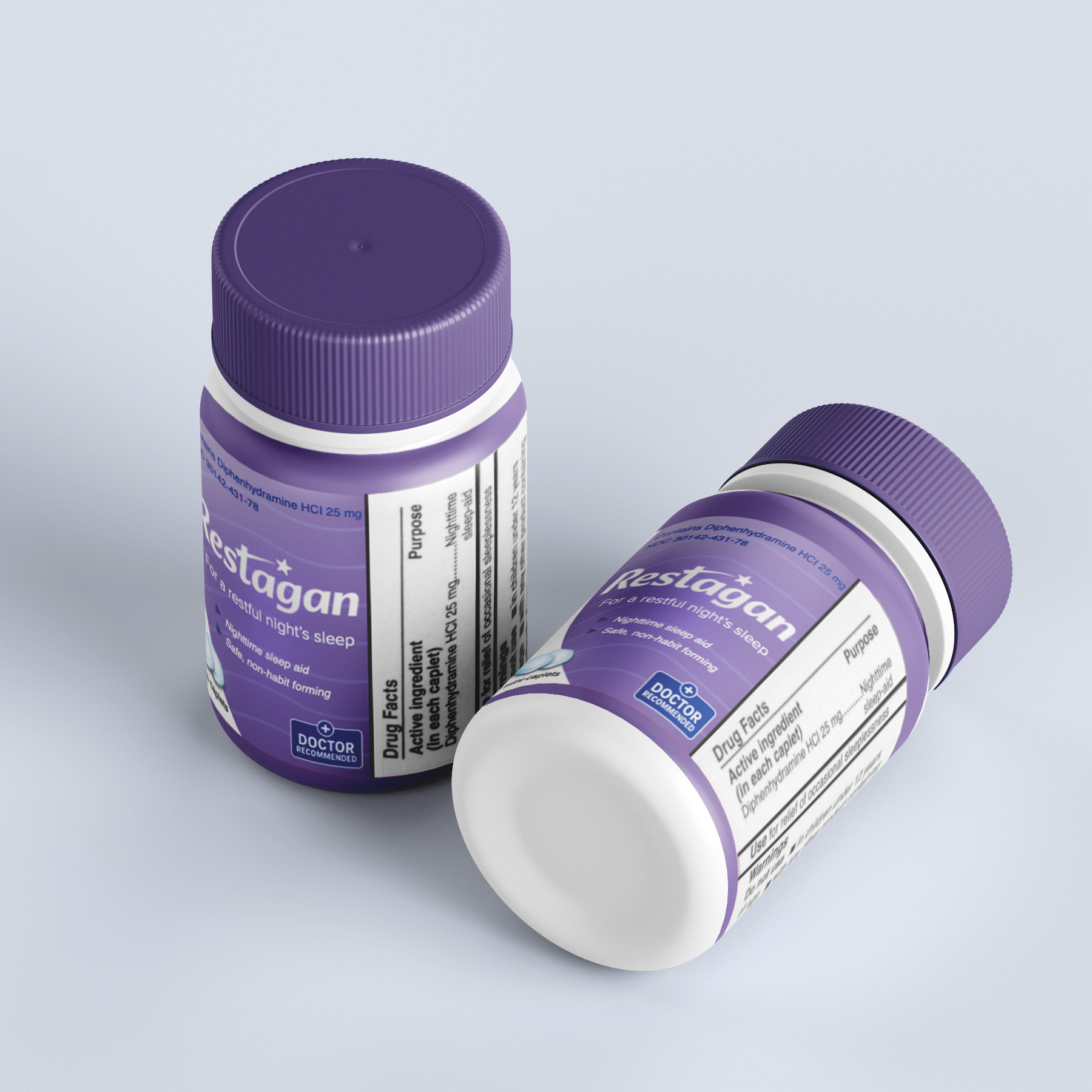
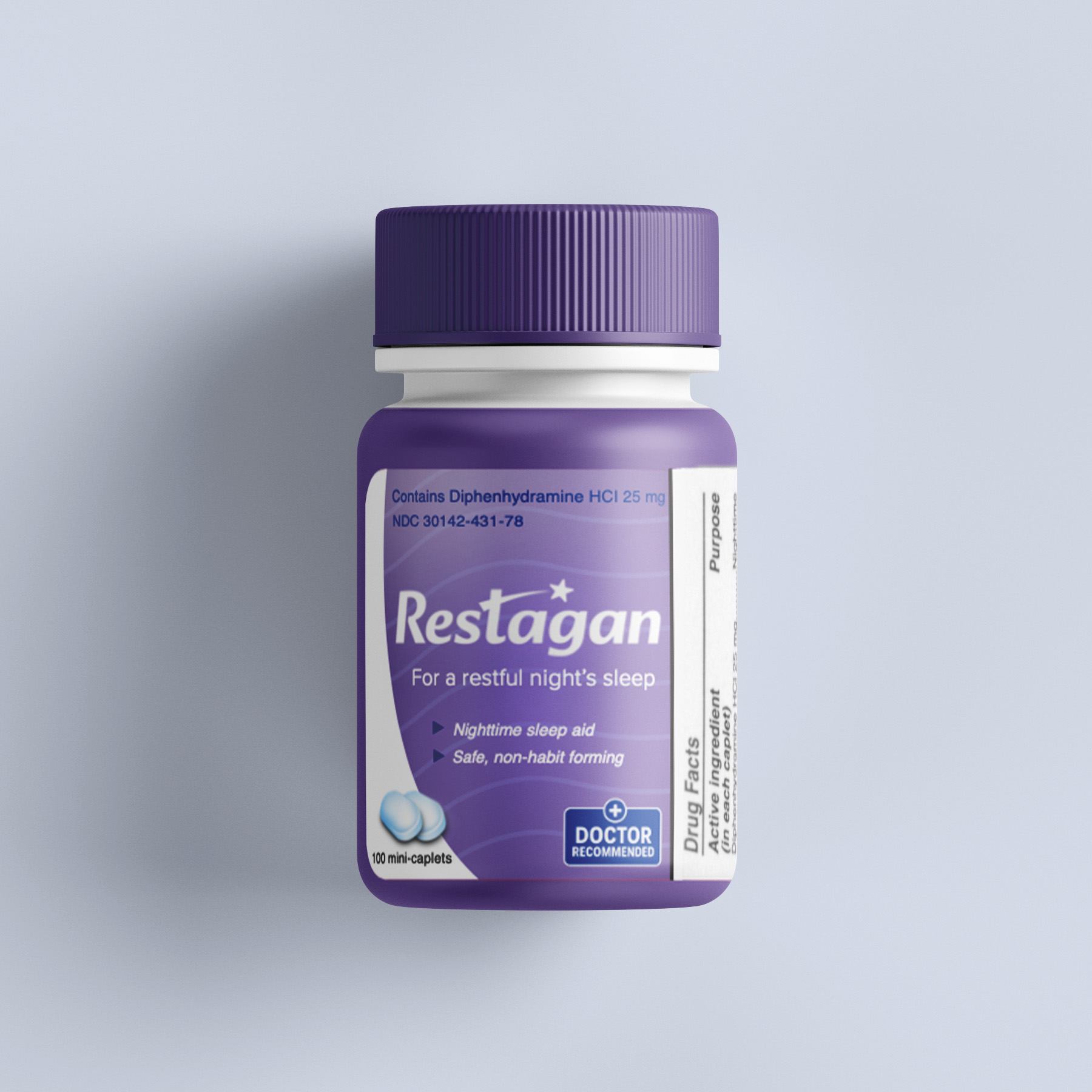
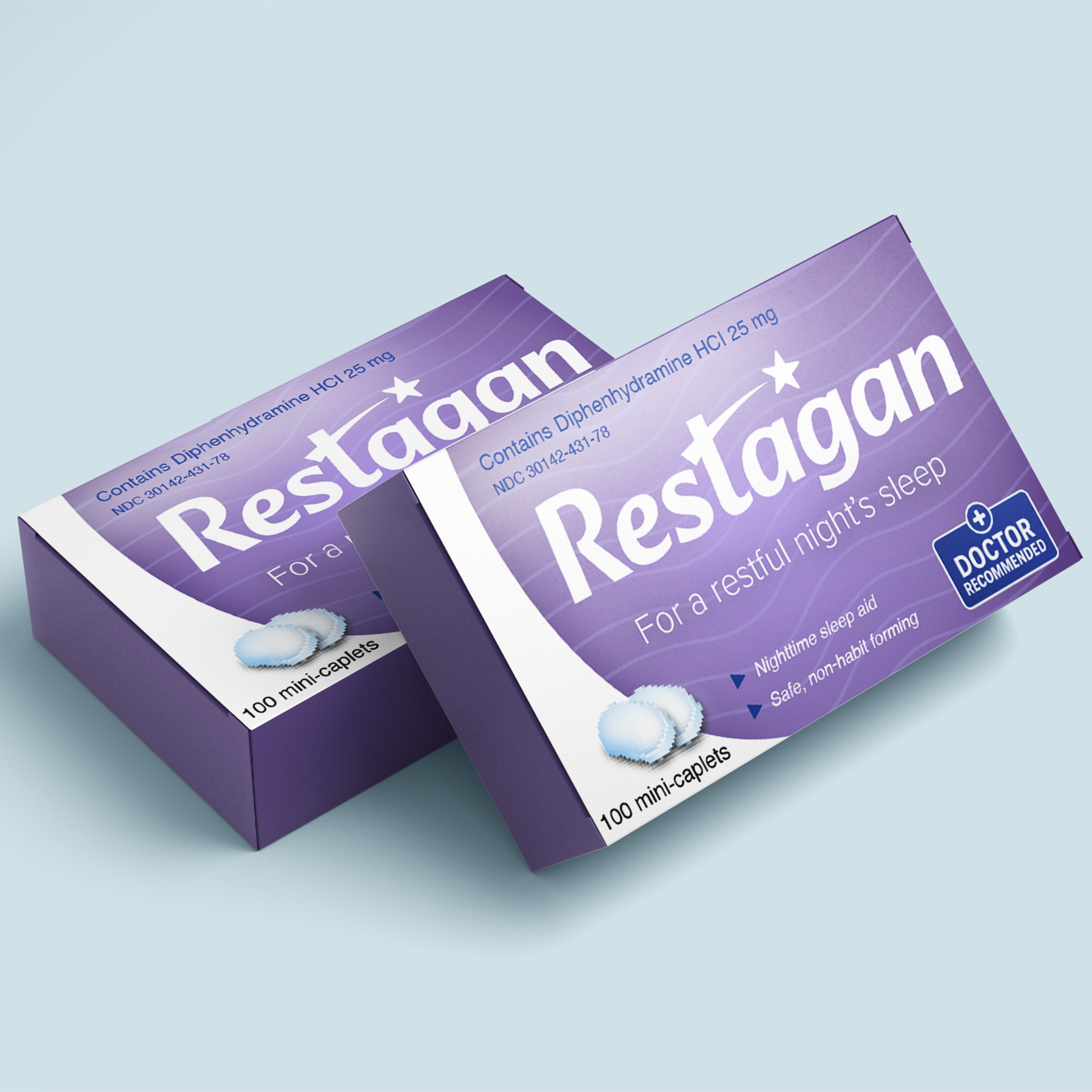
I created the branding and packaging design for Restagan, a sleep medication concept aimed at an older audience. The design focuses on building trust while remaining visually calming and easy to recognize. The packaging uses a clean and simple layout to ensure readability, with clear hierarchy for product name, benefits, and supporting information. A “doctor recommended” element was included to enhance credibility and appeal to consumers who prioritize safety and professional approval.
The visual system combines soft gradients, flowing wave patterns, and minimal design elements to create a sense of calm without overwhelming the viewer. The bold yet soothing purple color helps the product stand out on shelves while maintaining an appropriate medical aesthetic. The final result balances approachability, clarity, and professionalism, making the product feel both reliable and comforting.
• Logo & Branding
• Packaging Design
• Brand Identity
Adobe Illustrator