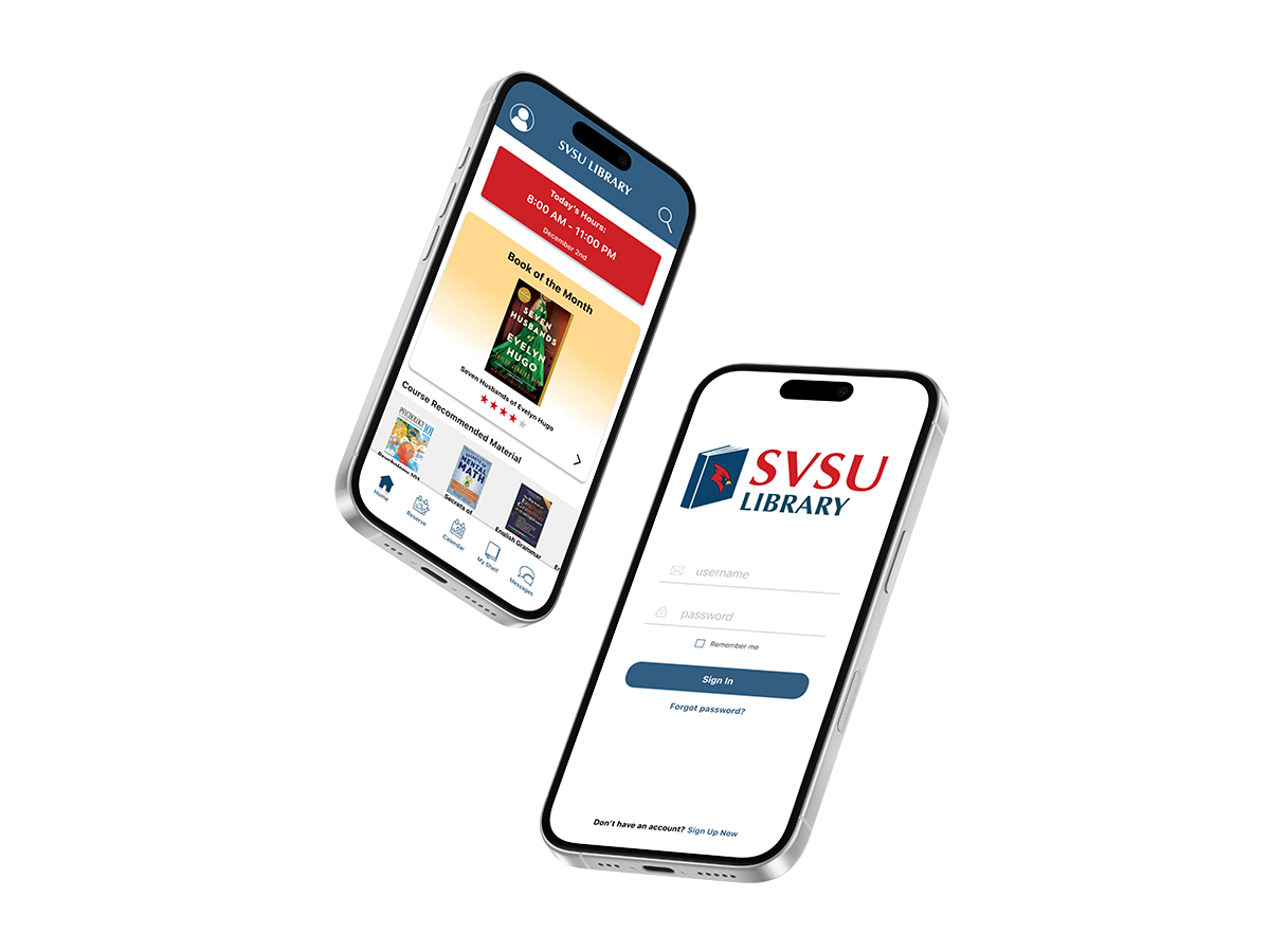
UX/UI CASE STUDY

SVSU Library App

COMPANY

Saginaw Valley State University

ROLE

UX/UI Designer

DELIVERABLES

Working Prototype

YEAR

2025

Project Overview

This project focuses on redesigning the Saginaw Valley State University library experience through a mobile application aimed at simplifying students’ daily academic tasks. The app allows users to search and check out books online, reserve study rooms, and create or join study groups—all in one place. The goal was to reduce friction in common library interactions and create a more efficient, user-friendly experience that better supports students’ needs both inside and outside the library.

UX Research

Target Markets

85%

Primary Audience

The primary audience for this project is SVSU students, specifically those between the ages of 18 and 25. This group includes both male and female students who are actively engaged in campus life and rely on digital resources to stay informed and connected.

15%

Secondary Audience

The secondary audience includes SVSU faculty, staff, and individuals connected to the university or library system. This group may use the app to access resources, support students, or stay informed about library services and updates. While not the primary focus, their involvement helps create a more connected and efficient academic environment.

User Thought Process/Interview Findings

User interviews were conducted with SVSU students to gain insight into their experiences, needs, and desired features for the app. Across interviews, students expressed a strong need for a more intuitive and streamlined way to interact with library services. Their feedback highlighted key opportunities to improve usability and create a more efficient, student-centered experience.

Key Findings from User Interviews:

• Frustration with navigating multiple pages and unclear pathways
• Issues with broken or unreliable links
• Strong interest in using a library app if it offers practical, time-saving tools
• High demand for features like article search, study room booking, and indoor navigation
• Desire for helpful notifications (due dates, room reminders, event updates)
• Students prioritize convenience, clarity, and efficiency in their experience
• Potential for the app to become a regularly used academic tool if it reduces confusion and saves time

User Testing

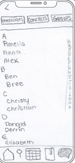
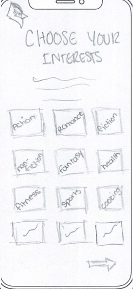
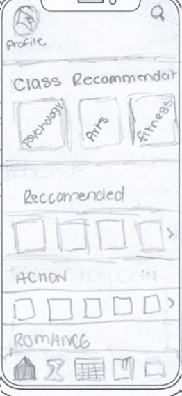
Low Fidelity Prototyping

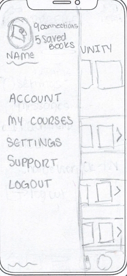
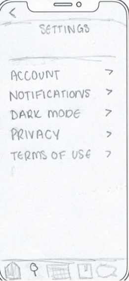
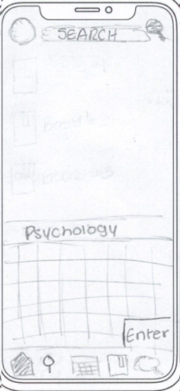
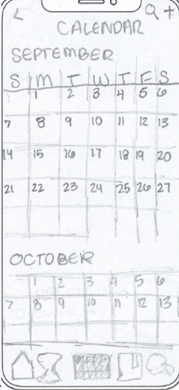
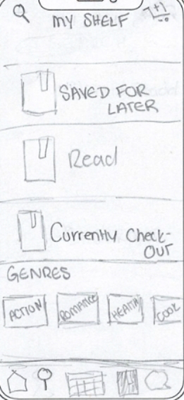
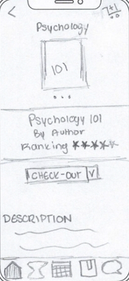
Low-fidelity, hand-drawn screens were created to quickly explore layout ideas and user flows. These sketches were used to build an early working prototype for user testing, allowing for rapid feedback and iteration before moving into higher-fidelity designs..

Usability Test on Low-Fidelity

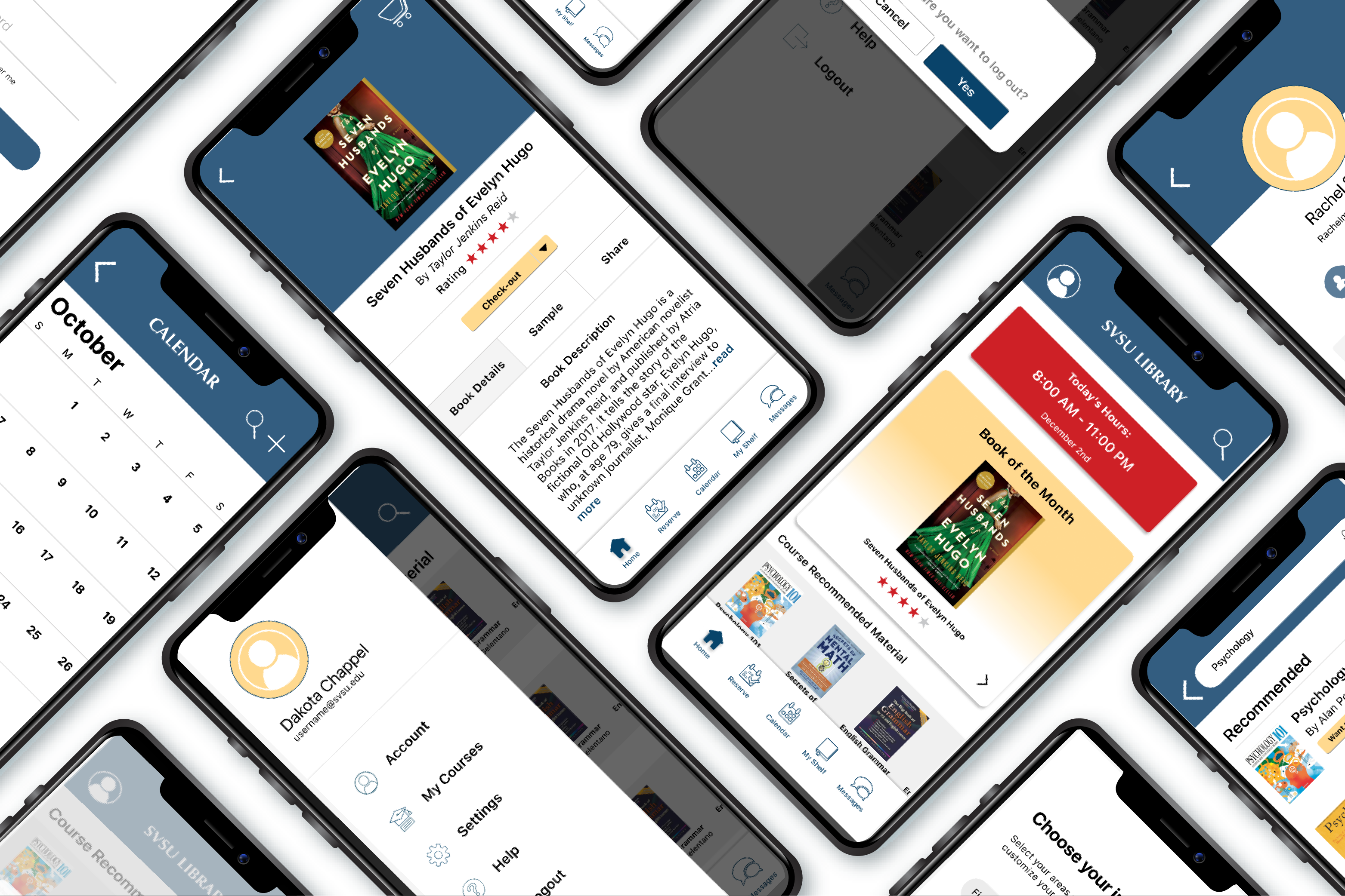
Participants completed task-based usability testing in a quiet environment using a think-aloud method. This allowed for real-time insight into user behavior, challenges, and areas for improvement.

Key Findings from Usability Test:

• Users found the overall layout easy to understand and navigate, especially due to its familiarity with common app patterns
• The reserve icon was unclear and should be redesigned for better recognition
• Key actions, such as the search bar, need to be more prominent and easier to access
• Adding clear labels and structure to core pages (like reservations) would improve usability
• Visual elements like color can help make reservation time and information easier to read
• Minor layout adjustments (such as inbox) could enhance the experience, though the current structure is still functional

Final Design

The final design integrates insights from client feedback, usability testing, and core design principles to create a functional and user-centered mobile app, with a familiar interface inspired by common platforms like Canvas to support intuitive navigation.

High Fidelity User Testing

High-fidelity usability testing was conducted using A/B testing and think-aloud protocols, where participants completed guided tasks while sharing their thoughts in real time. This allowed for validation of design decisions and refinement of the overall user experience.

Key Findings:

• Users found the app easy to navigate and intuitive to use
• The home page was well-received as a central "hub", especially with quick access to library hours
• Participants appreciated the ability to easily reserve study rooms within their app
• The reservation process felt similar to existing systems, but more streamlined and efficient
• Overall, users responded positively to the simplicity and clarity of the interface

Next Projects